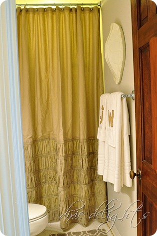

So before we moved in, we removed the medicine cabinet and shower door contraption, gave it a good scrubbing and painted the walls and vanity. We had all of the Pottery Barn Alphabet Soup decor from our old house and just made it work in the new space. See more of the Baby’s Bath here.

So now the teeniest space in the house has seen another update! With all the basics done, this before and after was really just about changing the decor.

Sources:
- Paint – Benjamin Moore Edgecomb Gray (walls) and Alabaster (vanity and trim)
- Mirror – Target (It was originally black but for this update I painted it in Annie Sloan’s Old White chalk paint with a clear glaze.)
- Light – Pullman Bath Light from Shades of Light
- Shower curtain – Target
- Rug – Target
- Towel bars & curtain rod – Home Depot
- Nate Berkus Tortoise Shell
- The Line Print from Old Try

I originally purchased the Nate Berkus tortoise shell for the baby’s big boy room but ran out of wall space. I’ve had the towels at least since the baby was born! They were from Love Street in Smyrna and feature burlap appliques of the littles’ first initials.

Y’all know I have a slight obsession with Old Try’s line of letterpressed prints. This particular one is called The Line and was also originally purchased for the big boy room. It is framed in an Ikea frame with a piece of art paper behind it since it didn’t fit exactly in the mat.

The shower curtain is from Target and was a real production, as things tend to be around here :-) I wanted to keep the height on the curtain since it makes the ceilings look so tall so I ended up buying two shower curtains and begging Mother to cutting the three ruffled bands off the bottom of the second and sewing them on to make the first the right height. I have a second lower rod back there that holds the plastic liner. The rug is also from Target, but I’ve had it for about a year now. I originally purchased it for the mud room and then I lost it so I purchased a new identical one and then I found it. Follow that?


I think this rendition of the boy’s bath should last a good long while!!
xoxo
See all of my Before & After decor here and our House Tour here.
Flattered for the feature at Le Chateau des Fleurs and Tatertots and Jello!
Find me at: Between Naps on the Porch, My Uncommon Slice of Suburbia, Savvy Southern Style, DIY by Design, Shabby Creek Cottage, Tatertots and Jello, A Stroll Through Life, French Country Cottage, No Minimalist Here, The36th Avenue, Bacon Time, It's Overflowing, At the Picket Fence,Shine on Fridays, DIY Show Off, House of Hepworth, Homemaker on a Dime, Stuff and Nonsense, 52 Mantels, I Heart Nap Time, The Frugal Girls,Six Sisters Stuff, One Project Closer,Jennifer Rizzo, Le Chateau des Fleurs, Not Just a Housewife

No comments:
Post a Comment